Artophobia - Behind the Scenes (Upgrades)
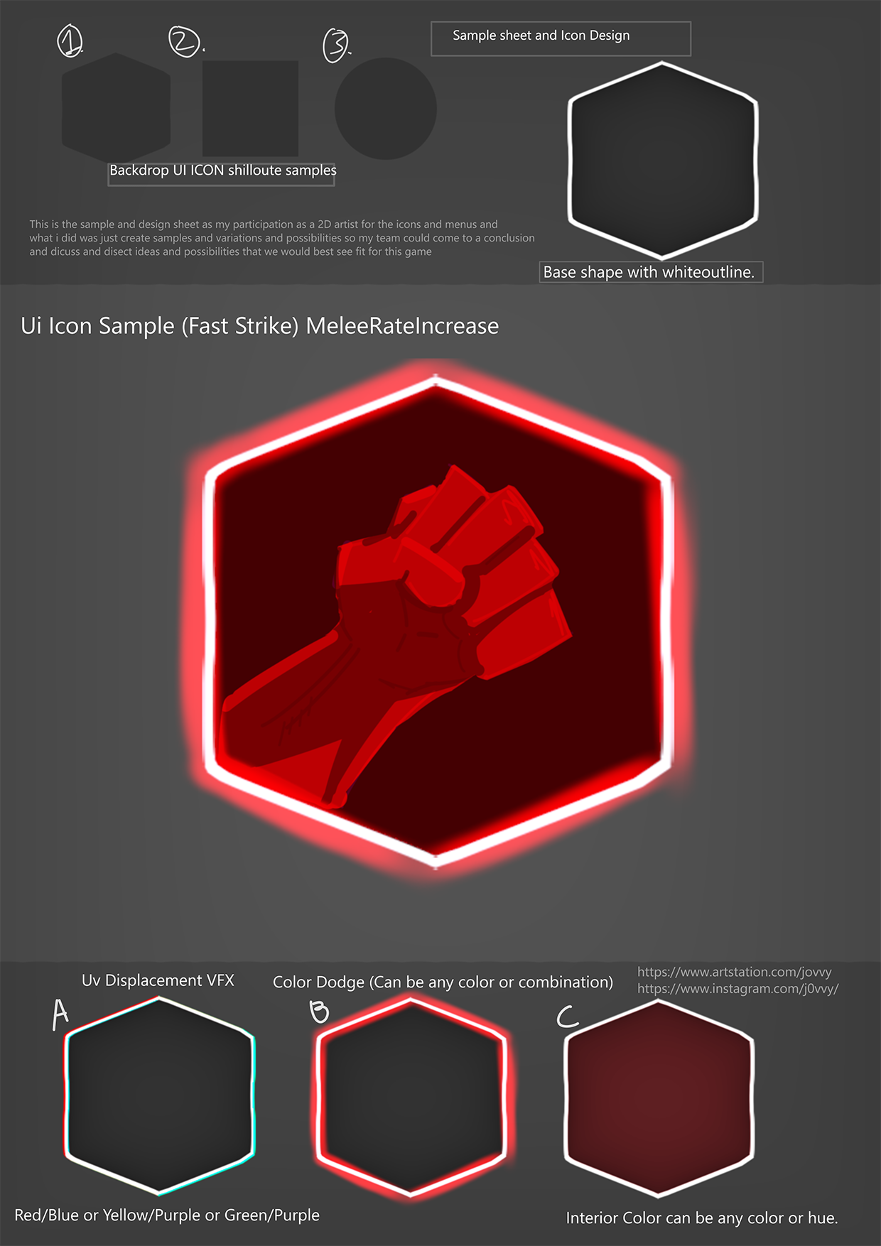
Heyo everyone! This is a very different post from our normal updates but I thought it'd be a great idea to go behind the scenes on how our icons were made (Huge credit to Jovvy, check him out on artstation. Also huge credit to Lluke123 who you can also check out on artstation) and how the upgrades work. I won't be going into any code, just going to be talking about the art and touching on how it works.
Note: I'll be referencing Lluke123 as Luke and Jovvy as Joey.
Let's start with the inspiration. Of course, we took HUGE inspiration from 20 minutes till dawn (which you can check out here if you haven't already) so we wanted to do something like that. After looking at a couple of images and playing the game for a bit, we had a good idea of what to do.
I made the UI in Unreal Engine and made a full system for adding the buttons on the UI construct. I then decided I want to go over the top (whoops) and make a spreadsheet full of the upgrades so we could easily change the upgrades. That then meant each button was completely randomised and picked a random upgrade within the list of upgrades.

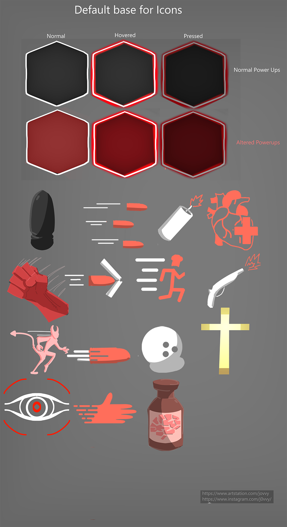
Then came the actual icons. Joey started off with making the icon layout and a couple of iterations on how they could look. This meant it was really easy for everyone to pitch in and say "I like this" which was extremely helpful for the design. It didn't take long to kick off from this sheet, we stuck with the icon sample Joey provided and stated how we want everything to be (which is a normal button, hovered button and pressed button). We also had the Alter Upgrades so we wanted a normal black background for the Normal Upgrades and then a red background for the Alter Upgrades.

Luke and Joey got to work together, making the icons. Luke made a brief concept of what the icon images should look like and Joey either used them or improved from them. This created a beautiful workflow of making everything faster so Joey could focus on making sure the buttons were exactly how we wanted whilst Luke made the icons.
After this was done, we had a beautiful sheet of what we wanted. Joey then put it all together in separate images so we could use them as buttons in-game!

All that was left was to attach the images to the struct and data table, make sure that they auto-applied the images when the button is created and tada! All the upgrades and icons were completed!
That's everything! Hope you liked this different style of post. I thought it'd be really interesting to cover and Joey gave me 2 nice sheets (which you've seen above) to put on itch so I thought I'd make good use of them. I also hope this helps anyone interested in how we pulled off the icons and art within 4 days. Again, make sure you check out Joey on Artstartion and Luke on Artstation. They are seriously talented and we wouldn't have had these amazing icons done in time if it wasn't for them.
Thank you for reading! We'll see you in the next dev-log!
- Jaskowicz
Get Artophobia
Artophobia
A Chef's worst nightmare.
| Status | In development |
| Authors | Jaskowicz, llukee, Jovvy2003, SuperGenshi, Max |
| Genre | Action, Shooter, Survival |
| Tags | 3D, Arcade, Horror, Low-poly, Point & Click, Short, Singleplayer |
More posts
- Artophobia - Linux Support!Aug 01, 2022
- Artophobia - 1.4Jul 01, 2022
- Artophobia - 1.3Jun 23, 2022
- Artophobia - 1.2Jun 22, 2022
- Artophobia - 1.1Jun 21, 2022
Leave a comment
Log in with itch.io to leave a comment.